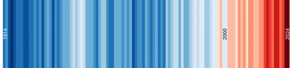
Professor Ed Hawkins, from Reading University, has done a fabulous job of illustrating temperature change using “climate stripes”. The example here shows the global mean temperature from 1914 to 2024. Blue colours are relatively cold years and reds are the hot ones. Notice that all the hot years start around the year 2000.
Some people claim that this global average data is not reliable or even that it has been deliberately fiddled. However, look at the temperature data for individual locations on Earth and you will see the same pattern. The only exceptions are 8 scientific stations on the Antarctic coast; everywhere else (including most of Antarctica) has experienced accelerating warming in the last few decades.
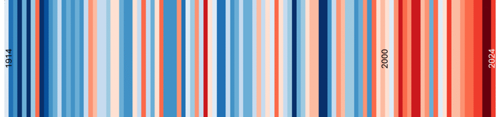
As an example, here are the stripes for Eskdalemuir, in very rural Scotland, over the same range of years. Unsurprisingly, it’s not as smooth as the global average but it still shows the same pattern of mostly blue before 2000 and mostly red after that. Nine out of the ten hottest years ever recorded at Eskdalemuir have been in the years since 2000.
Perhaps you believe that all the temperature data is faked. That’s data going back hundreds of years and produced by thousands of different people in hundreds of different locations. All of those people would have had to be in on a massive conspiracy with none of them ever spilling the beans. It’s just not credible.